Imagine visiting a website where the color palette clashes, leaving you confused and unsettled. Now, contrast that with a site whose colors seem to guide you intuitively, making your experience seamless and enjoyable. That difference underscores the powerful role of color in UI/UX Design.
UI/UX Design isn’t just about making things look pretty, it’s about creating intuitive, user-friendly experiences that deeply resonate with the users. And nothing connects better than color. Color has the unique ability to influence mood, perceptions, and even decision-making. In this post, we’ll dive into the psychology of color in UI/UX Design and how it shapes user behavior.
Why Color Matters in UI/UX Design
Color isn’t just a visual element; it’s a communication tool. According to a study by Colorcom, people make a subconscious decision about a product within the first 90 seconds of viewing it. And up to 90% of those decisions are based on color alone. This makes choosing the right colors in UI/UX Design a critical task.
The Emotional Connection
Colors evoke emotions. For instance:
- Red: Passion, urgency, or danger.
- Blue: Trust, calmness, and stability.
- Yellow: Happiness and optimism.
These emotional triggers are universal, though they can vary slightly depending on cultural contexts. A good UI/UX designer leverages this emotional impact to guide user interactions and create a memorable experience.
Improving Brand Identity
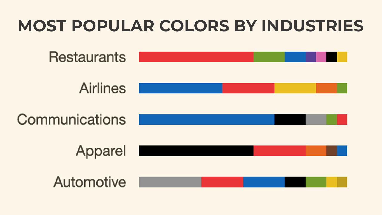
Color is also integral to brand recognition. Consider brands like Facebook, LinkedIn, or Twitter. Their blue-centric design conveys trust and professionalism. In UI/UX Design, consistent use of brand colors across platforms reinforces identity and builds trust.
The Science Behind Color Psychology
The way colors influence us isn’t arbitrary—it’s deeply rooted in psychology and biology. Our brains associate colors with specific feelings or memories. For example, green is often linked to nature and growth, while red can signal danger or excitement.
In UI/UX Design, these associations play a crucial role in directing user attention, eliciting desired actions, and ensuring a cohesive visual experience.
Warm vs. Cool Colors
Colors are often classified as warm (red, orange, yellow) or cool (blue, green, purple). Warm colors are stimulating, while cool colors are calming. Knowing this distinction helps designers:
- Use warm colors for calls to action or sales banners to create urgency.
- Apply cool tones in backgrounds to promote focus and comfort.
The Role of Contrast
Contrast is essential for readability and accessibility. The Web Content Accessibility Guidelines suggest a contrast ratio of 4.5:1 for text and background colors. Using high contrast ensures that text remains legible and interfaces are user-friendly for people with visual impairments.
The Neurological Impact of Color
Studies suggest that colors activate specific regions in the brain. For example, red stimulates the amygdala, heightening alertness and urgency, while blue activates the prefrontal cortex, fostering concentration and calmness. Understanding these neurological effects can help designers craft user interfaces that align with the intended user experience.
Practical Applications of Color in UI/UX Design
-
Guiding User Behavior
Colors can subtly direct user behavior by highlighting important elements like buttons, links, or form fields. For instance, using a bright color like red or orange for a “Buy Now” button draws immediate attention, prompting action.
Amazon’s use of yellow for its “Add to Cart” button stands out against its white background, making it instantly recognizable. This strategic use of color ensures users know exactly where to click.
-
Establishing Hierarchy
In UI/UX Design, colors help establish a visual hierarchy. Designers use varying shades and tones to differentiate between primary and secondary elements, ensuring users focus on the most critical components first.
Example:
A primary call-to-action button might be a bold blue, while secondary options are subdued in gray. This contrast directs users to the desired action without overwhelming them.
-
Increasing Accessibility
Accessibility is a cornerstone of modern design. Designers must consider users with special needs or visual impairments. Tools like Color Oracle simulate how designs appear to color-blind users, ensuring inclusivity.
Beyond Visuals: Inclusive Design
Inclusivity extends beyond color blindness. For instance, pairing color indicators with text or icons ensures that all users can navigate an interface effectively, regardless of their visual capabilities.
How Different Industries Use Color in UI/UX Design
The choice of colors often depends on the target audience and industry. Let’s look at some examples:
-
E commerce
E-commerce platforms often use vibrant colors to create urgency and drive conversions. Red, for instance, is commonly used for discounts or limited time offers.
eBay’s color scheme includes bold reds and yellows to emphasize deals and promotions, encouraging users to take immediate action.
-
Healthcare
Healthcare apps and websites prioritize trust and calmness, often using blues and greens.
WebMD’s blue and white interface promotes a sense of trustworthiness and clarity, essential for a platform providing medical information.
-
Entertainment
Entertainment platforms experiment with bold and contrasting colors to evoke excitement and engagement.
Netflix’s black and red theme is dramatic and attention-grabbing, perfectly aligning with its brand identity.
-
Education
Educational platforms often use greens and blues to convey growth and trust. These colors help create a focused environment for learners.
Duolingo uses a cheerful green palette that reflects its friendly and engaging approach to language learning.
Common Mistakes When Using Colors in UI/UX Design
Even the best intentions can go awry if colors are misused. Here are some common pitfalls:
-
Overusing Bright Colors
While bright colors grab attention, overusing them can overwhelm users and dilute their impact. Instead, balance bright elements with neutral tones.
-
Ignoring Cultural Differences
Colors have different meanings across cultures. For example, while white signifies purity in Western cultures, it’s associated with mourning in some Asian cultures. Designers targeting a global audience must consider these nuances.
-
Poor Contrast Choices
Low contrast between text and background makes content hard to read. Always test contrast ratios to ensure readability.
-
Neglecting Emotional Resonance
Failing to align color choices with the intended emotional tone of the product can create a disconnect, undermining the user experience.
Trends in Color Usage for UI/UX Design
As design evolves, so do color trends. Staying updated with these trends ensures designs feel fresh and relevant:
-
Gradients
Gradients are making a comeback. And it is adding depth and dimension to flat designs. They are widely used in buttons, backgrounds, and logos.
Example:
Instagram’s gradient logo is iconic, setting it apart in a sea of flat designs.
-
Dark Mode
Dark mode has become popular among users due to its aesthetic appeal plus the reduced strain on the eyes. It also allows colors to pop more vividly against dark backgrounds.
-
Monochromatic Schemes
Monochromatic designs use varying shades of a single color, creating a cohesive and minimalist aesthetic.
-
Dynamic Color Palettes
AI-driven dynamic color palettes adapt to user preferences, offering personalized experiences. These are increasingly seen in apps that prioritize user-centric design.
Tips for Mastering Color in UI/UX Design
- Research Your Audience: Understand the emotions and associations your target users have with specific colors.
- Start with a Palette: Use tools like Adobe Color to create harmonious color schemes.
- Test and Iterate: Conduct A/B testing to determine which color combinations yield the best results.
- Keep Accessibility in Mind: Always check contrast ratios and consider users with visual impairments.
- Stay Consistent: Use colors consistently across your platform to reinforce brand identity.
- Combine Science with Creativity: While data-driven decisions are essential, don’t shy away from experimenting with unique color combinations.
The Future of Color in UI/UX Design
As technology advances, the role of color in UI/UX Design will only grow. Emerging trends like AR & VR will introduce new dimensions to color usage, enabling even more immersive experiences.
For example, in VR environments, colors might be used to guide users through complex interfaces or signal important information in real-time. Similarly, AI-driven tools could analyze user preferences to dynamically adjust color schemes, creating hyper-personalized experiences.
Another exciting frontier is the integration of biofeedback into design. Imagine interfaces that adjust color schemes based on the user’s heart rate or mood, creating a responsive and adaptive user experience.
Designers of the future will also explore how color can be optimized for emerging technologies, such as foldable screens and holographic displays. As devices evolve, so too will the palette of tools available to ensure usability and aesthetic harmony. In this ever-changing landscape, color will remain an indispensable asset for crafting intuitive and engaging user experiences.
Final Thoughts
Color isn’t just a design element; it’s a powerful tool that shapes how users interact with interfaces. By understanding the psychology of color and its application in UI/UX Design, designers can create experiences that resonate with the end users on both functional and emotional levels.
Whether you’re crafting a bold e-commerce site or a calming healthcare app, the key lies in thoughtful, purposeful design. Use color strategically, and you’ll not only capture attention but also create lasting connections with your users.
The journey of mastering color in UI/UX Design is a continuous process of learning, experimenting, and refining. As trends evolve and technologies emerge, staying adaptable and informed will make sure your designs remain impactful and relevant.


